
Logo Design for Healthcare
A healthcare logo needs to communicate trust, professionalism, care, and credibility before a patient reads a single word. At 3C Brand Hub, we create healthcare brand identities that reflect the nature of your healthcare business while giving it a distinctive and usable visual presence.
Our logo design for healthcare services are suited for clinics, hospitals, pharmacies, diagnostic centers, wellness brands, dental practices, therapists, home healthcare providers, medical technology companies, and healthcare startups.
The goal is not to simply add a medical symbol to your business name. We develop an identity that fits your audience, services, positioning, and the way your brand will appear across different touchpoints.
A healthcare identity should feel trustworthy without looking predictable.
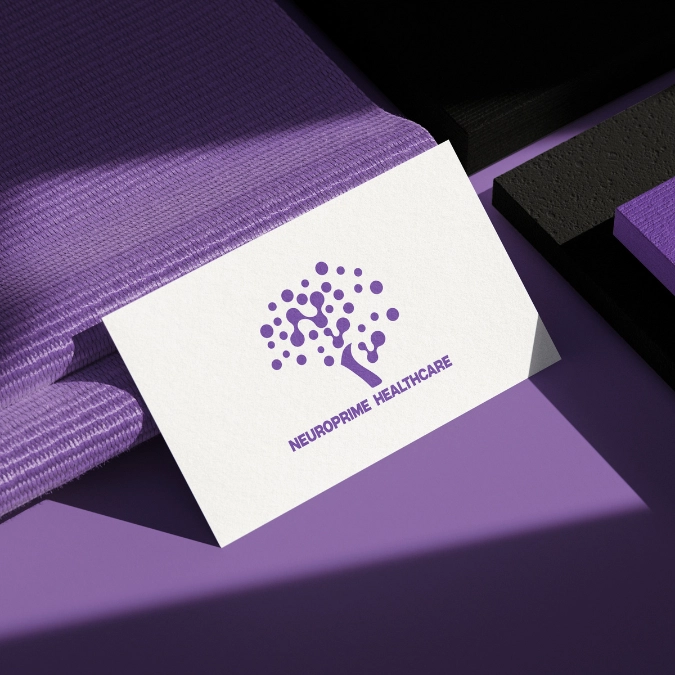
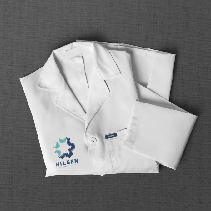
Every healthcare business has a different audience, service model, and brand personality. A neighbourhood clinic may need a warm and approachable identity, while a medical technology company may require a more modern and technology-focused visual language. Our healthcare logo portfolio brings together different approaches to healthcare branding and visual identity. Browse the selected designs below to see how typography, colour, symbols, shapes, and composition can be combined to create distinct healthcare identities. Explore Logo Design Examples.

Why Healthcare Businesses Need a Specialized Visual Identity
Healthcare branding has a different communication challenge from many other industries. Patients often make decisions based on trust, familiarity, accessibility, and perceived professionalism. A logo becomes one of the first visual cues associated with that experience. For a healthcare organization, the identity may appear on:







Good healthcare logo design starts with understanding what the organization needs to communicate. The visual choices should support that positioning rather than follow a fixed medical design formula.
A healthcare logo should be easy to identify without becoming visually complicated. Simple forms, balanced composition, and appropriate spacing can help the identity remain recognizable across different applications.
A children's healthcare brand may need a more approachable visual language, while a specialist medical practice may require a refined and professional identity. The audience influences the choice of typography, colour, imagery, and overall composition.
Healthcare brands often use familiar visual references. Crosses, hearts, medical icons, leaves, and human figures can communicate the category quickly, but using them without a distinctive concept can make several brands look alike. A strong identity considers familiar associations while finding an individual visual direction.
The logo should work beyond the website header. It needs to remain usable on signage, uniforms, stationery, packaging, social media, digital interfaces, and other brand applications.
Healthcare Logo Ideas That Fit Different Business Types
Hospital identities often need to communicate reliability, organization, accessibility, and professional medical care. A structured composition and restrained visual system can create an identity that works across signage, departments, digital platforms, and printed communication.
A clinic may need to feel professional while remaining approachable to patients. Typography, colour, and simple visual elements can help create an identity that feels appropriate for both medical expertise and patient care.
Pharmacy branding needs to be recognizable in both physical and digital environments. The identity can use clear typography and carefully considered symbols without depending entirely on conventional pharmaceutical imagery.
Digital health platforms, telehealth companies, healthcare software providers, and medical technology businesses often need a more contemporary identity. Their logo needs to work particularly well across websites, mobile interfaces, applications, presentations, and digital products.
Diagnostics businesses often communicate accuracy, technology, and reliability. Their visual identity can therefore use clean forms, structured layouts, and contemporary typography to support those associations.
Wellness businesses may require a softer and more human visual direction. Colour palettes, organic forms, typography, and subtle symbolism can create an identity suited to wellness, nutrition, fitness, recovery, or preventive healthcare.
A logo for home health care should communicate care and reliability while also feeling accessible to families and patients. The design can focus on human connection and support rather than relying only on traditional medical symbols.
Dental practices, counselling services, therapy providers, and mental health brands may require identities that feel specialized without becoming overly clinical. The visual language can be adapted around the type of care, audience, and desired brand personality.
Healthcare Logo Design Ideas Beyond the Medical Cross
- Abstract forms representing connection or care
- Geometric shapes suggesting precision and structure
- Human-inspired forms that communicate compassion
- Subtle references to health or movement
- Custom symbols developed around the brand name
- Negative space used to create secondary meanings
- Letterforms developed into distinctive visual marks
The objective is to make the visual identity relevant to healthcare without making it look interchangeable with another medical business.
Typography influences the personality of the identity. A clean sans-serif typeface may communicate modernity and accessibility, while a more refined typographic treatment may suit a specialist or premium healthcare service. Legibility remains important, particularly when the logo appears on signage, forms, websites, or mobile interfaces.
Colour selection should support the brand's positioning and audience. Blues and greens are common in healthcare because of their established associations with cleanliness, calmness, nature, and trust, but they are not the only possibilities. A carefully developed colour palette can help a brand establish its own visual territory while remaining appropriate for the healthcare sector.
Symbols should have a clear reason for being part of the identity. Instead of adding a generic medical icon, we look at how shapes and visual references can connect to the organization's services or positioning.
Spacing affects clarity and perceived quality. A balanced composition allows the logo to remain readable and recognizable instead of becoming crowded with unnecessary elements.
A logo is one component of a broader brand identity. The same visual language may eventually influence website design, social media graphics, stationery, packaging, signage, presentations, and other marketing materials.
That makes consistency important.
The logo, typography, colour palette, imagery, iconography, and supporting design elements should work together rather than appear as unrelated decisions.
For healthcare businesses, this consistency can help create a recognizable identity across patient-facing and professional communication.
At 3C Brand Hub, the design process begins with the business rather than a collection of ready-made healthcare symbols.
We look at the business, its healthcare category, audience, positioning, competitors, and the environment in which the identity will be used. This helps establish what the logo needs to communicate and where the brand can develop a distinctive visual direction.
The next stage focuses on developing visual concepts around the brand. Typography, colour, symbols, shapes, proportions, and composition are considered together rather than as isolated elements. The aim is to create a concept that has a clear connection to the business.
A selected direction is refined to improve balance, legibility, proportion, and visual consistency. Details that may appear small can have a significant effect on how the finished identity works.
The identity is considered in practical contexts so that it can function across relevant brand touchpoints. Scalable artwork and appropriate logo variations are important when a healthcare brand needs to operate across different sizes and platforms.
What You Receive From Our Healthcare Logo Design Service
The exact requirements of every project can differ based on the business and scope. Our logo design service focuses on developing a professional visual identity that is appropriate for the healthcare brand and practical for its intended applications.
The project can involve consideration of:
- Logo concept and visual direction based on the business
- Typography and colour choices suited to the brand
- Custom symbols or graphic elements where relevant
- Logo variations for different applications
- Scalable artwork suitable for different sizes
- Visual consistency across digital and physical touchpoints
- Brand guidance that helps maintain the identity consistently

Your healthcare business has its own services, audience, positioning, and approach to care. Its visual identity should reflect those differences. If you are launching a new healthcare business, rebranding an existing practice, or developing a new identity for a healthcare product or service, 3C Brand Hub can help you develop a logo that fits the brand and its real-world applications. From clinics and hospitals to pharmacies, diagnostics, wellness brands, home healthcare, dental practices, and medical technology companies, we develop visual identities around the specific needs of the business.