Logo Design Examples and Samples for Businesses
A logo is often the first visual element people associate with a business. Its shape, typography and colours can influence how people recognise and remember a brand. Looking at different logo design examples can help you understand which styles suit your business name, audience and industry.
This collection covers different types of logos, from simple wordmarks and lettermarks to abstract symbols, mascots and combination marks. You can explore these styles, compare their uses and find ideas for building a visual identity that fits your business.
Explore by Style: The Core Types of Logos
Understanding the different structural categories of logo design will help you communicate exactly what you need. Here are standout examples of a logo design broken down by their industry-standard types.
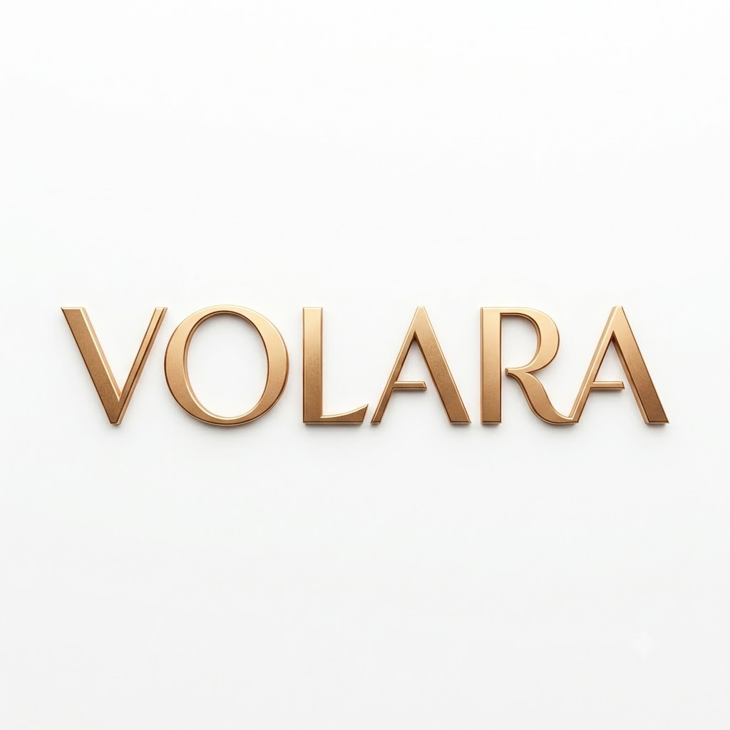
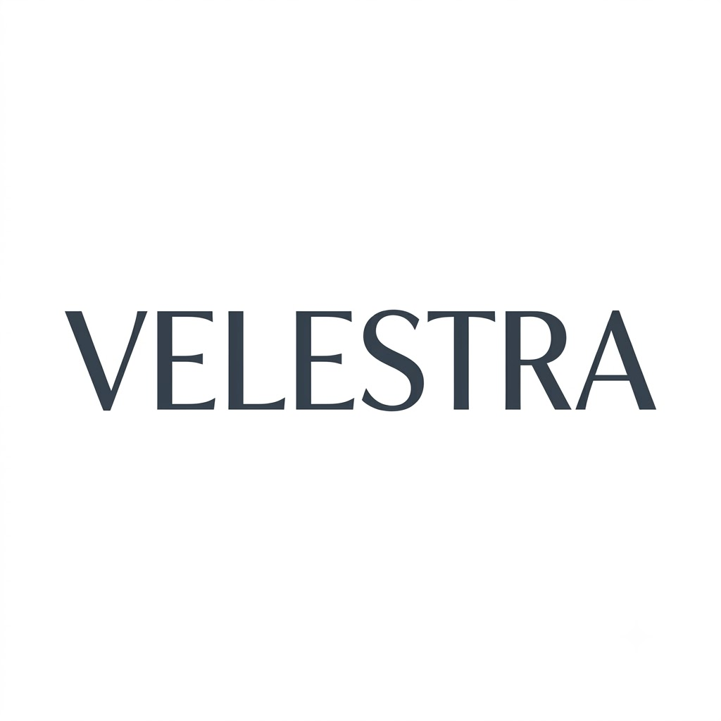
Logotype & Wordmark Logo Examples
A wordmark uses the business name as the main visual element. Custom lettering, spacing and typography give the name its identity without relying on a separate symbol. This style works well for businesses with distinctive names that want their brand name to remain easy to recognise across websites, packaging and printed materials.
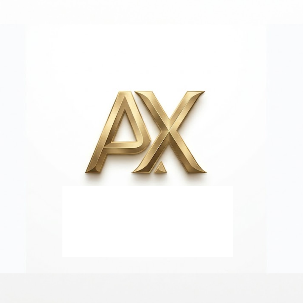
Lettermark (Monogram) Logos
A lettermark uses one or more initials instead of the full business name. It can be useful for companies with long names or names that are difficult to fit into smaller spaces. The design needs to remain readable and distinctive so people can recognise the initials without confusing them with other brands.
Logomark Examples (Pictorial Marks)
A pictorial mark uses a recognisable image or symbol as its main element. The symbol may represent a product, an object associated with the business or an idea linked to its identity. A well-chosen pictorial mark can make a brand easier to identify, especially when used consistently across digital and physical touchpoints.

Abstract Logo Marks
An abstract mark uses shapes, lines or geometric forms to create a distinctive symbol. Rather than showing a literal object, the design communicates an idea through its form and visual balance. This approach gives businesses room to develop their own identity, but the symbol should have a clear design rationale rather than relying on appearance alone.
Mascot Logos
A mascot logo features a character that represents the business. It may be an illustrated person, an animal or a fictional figure. Mascots can suit brands that want a recognisable personality across advertising, packaging and social media. The character should match the intended audience and remain clear when reproduced at different sizes.

Emblem Logo Example
An emblem combines text and visual elements within a badge, seal or other enclosed shape. It can suit businesses that want a traditional, formal or heritage-inspired appearance. Since emblems may contain several details, the design should be tested at smaller sizes to ensure the name and key elements remain legible.

Combination Marks
A combination mark brings together a wordmark or lettermark and a separate symbol. This gives businesses a way to present the full name alongside a visual identifier. Depending on the design, the elements may appear together or be used separately across different applications. The choice should reflect the brand's needs, not a rule that one logo type suits every business.
Logo Design Templates & Presentation Guides
Many founders begin their branding journey by searching for free logo design templates or a basic company logo template. While a pre-made logo template can be a great way to brainstorm, a growing business ultimately needs a unique, custom identity to secure trademark rights and truly stand out. However, templates are incredibly useful for managing and presenting your final brand assets! At 3C Brand Hub, we believe in equipping our clients with the right tools. We use robust frameworks to ensure every brand we build is consistent:
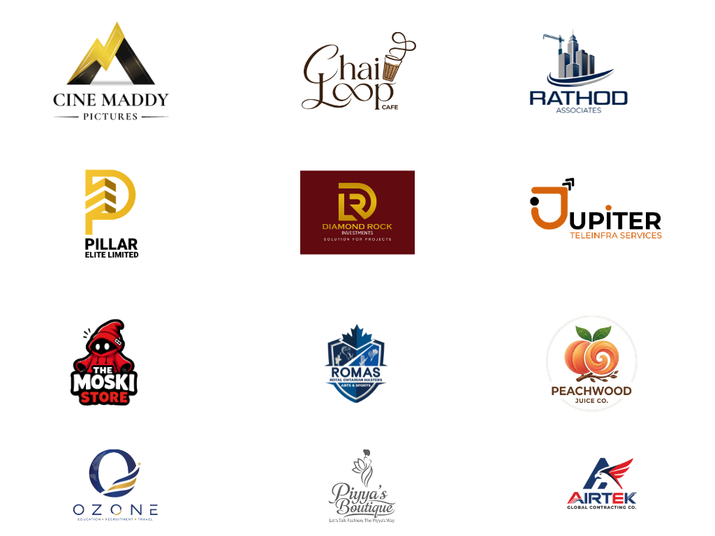
Logo templates can help you explore different layouts, typography and visual styles before deciding on a direction for your business. They are useful for early inspiration, but the same template may be available to many other users. Before using a template commercially, review its licence and usage restrictions. Check whether it permits commercial use, modifications and the applications you need. You should also assess whether the resulting design is distinctive enough for your brand.A custom logo can give your business more control over its visual identity, but commissioning a designer does not automatically guarantee trademark registration or legal protection. If you intend to register your logo, consider checking for similar existing marks and seek appropriate trademark advice.
A logo presentation template helps designers show how a proposed identity may look across different applications. It can include logo variations, colour palettes, typography, business cards, packaging and digital mockups. A useful presentation should explain the thinking behind the design, not just display attractive visuals. Show the primary logo, any approved alternate versions and examples of how the identity could appear on light and dark backgrounds. Testing these applications helps identify issues with readability, contrast, spacing and scalability. A logo that looks good in a large presentation may need adjustments before it works well as a small website icon or on printed materials.
How to Choose the Right Logo Type for Your Business
The right logo style depends on your business name, audience, positioning and where the identity will appear. A design that works for a retail brand may not suit a professional consultancy or a technology company.
Consider these points before choosing a direction:
- Business name: A short, distinctive name may work well as a wordmark, while a long name may benefit from a lettermark or a combination mark.
- Brand personality: Consider whether your business needs a formal, playful, modern or traditional visual identity.
- Target audience: Choose a style that feels appropriate to the people you want to reach.
- Practical use: Check how the logo will appear on your website, social media profiles, packaging, signage and printed materials.
- Long-term use: Avoid design choices that depend too heavily on short-lived trends.
Use logo design samples as a starting point, not as designs to copy. The aim is to identify what works for your business and develop an identity that people can associate with your brand.
The Logo Design Process
At 3C Brand Hub, we turn these inspiring logo design examples into real, successful client projects. Our professional process includes:
Discovery & Strategy: Our logo designers learn about your goals, audience, and overall brand identity.
Concept Creation: We design multiple unique logo design samples tailored specifically to your business.
Refinement: We work with your feedback to perfect the typography, corporate color palettes, and layout.
Final Delivery: You receive all scalable vector assets and a brand guide so your logo looks perfect everywhere.
What Makes a Good Logo Design?
A good logo is not defined by how complex, colourful or trendy it looks. It should represent the business appropriately, remain recognisable and work across the places where customers encounter the brand. When reviewing logo design samples, consider the following characteristics.
Clear and Easy to Recognise
A logo should communicate its visual identity without requiring people to study every detail. Simple shapes, considered typography and a clear arrangement of elements can help people recognise it quickly. Simplicity does not mean every logo must be minimal; it means each element should have a purpose.
Suitable for the Business
The design should reflect the company’s positioning, audience and personality. A playful illustration may suit a children’s product brand but may not fit a consultancy serving corporate clients. The visual style should support the message the business wants to communicate.
Distinctive from Competitors
A logo should help a business establish its own identity rather than look interchangeable with other companies in the same industry. Reviewing competitors can reveal common colours, symbols and design approaches. These patterns can inform the creative direction, but copying a competitor’s identity can create confusion and potential legal concerns.
Readable at Different Sizes
A logo may appear on a large sign, a website header, a business card or a small social media icon. Important details should remain visible at the sizes relevant to its intended use. Designs with fine lines, small text or complicated illustrations may require simplified versions for smaller applications.
Suitable for Different Backgrounds
The logo should have appropriate versions for light and dark backgrounds where needed. Colour, contrast and spacing should be tested against the materials and digital environments where the identity will appear.
Consistent Across Applications
A logo is one part of a wider visual identity. Its use should remain consistent across packaging, documents, marketing materials and digital platforms. Approved variations can provide flexibility without making the brand look different in every application.
Logo Design Examples for Different Industries
The requirements of a logo depend on the business it represents. A restaurant may need an identity that works on menus, packaging and storefronts, while a technology company may need a design that remains clear across websites, software interfaces and presentations. Looking at examples from different industries can help businesses understand how visual choices relate to their products, customers and market.
Logo Design Examples for Technology Companies
Technology businesses often need logos that work across websites, applications, software dashboards and digital products. Simple symbols, distinctive typography and balanced proportions can help maintain clarity at different sizes. The design should reflect the company’s positioning rather than relying on generic circuit patterns or digital symbols.
Logo Design Examples for Restaurants and Cafés
Restaurant logos appear on menus, takeaway packaging, storefront signs, delivery platforms and social media. Typography, illustrations and colour choices can help communicate the type of dining experience a business offers. A café may choose a relaxed, character-led identity, while a fine-dining restaurant may prefer a more restrained visual style.
Logo Design Examples for Fashion and Clothing Brands
Fashion logos often need to work on labels, tags, packaging, websites and promotional materials. Some brands use typography as the main feature, while others develop a symbol or monogram. The design should suit the intended market and remain recognisable when reproduced on different materials.
Logo Design Examples for Healthcare Businesses
Healthcare logos should support a clear and trustworthy visual identity. Clinics, hospitals and wellness businesses may use typography and carefully considered symbols to communicate their services. Designs should avoid unnecessary detail, particularly when the logo needs to appear on appointment documents, signage and digital platforms.
Logo Design Examples for Education Companies
Schools, training institutes and educational businesses need logos that can be used across certificates, websites, uniforms, brochures and learning platforms. The visual direction may vary depending on the institution’s audience and positioning. A children’s learning centre may use friendly illustrations, while a professional training provider may need a more formal identity.
Logo Design Examples for Real Estate Companies
Real estate businesses often use logos across property boards, brochures, websites, business cards and project presentations. Typography and geometric forms can help establish a consistent identity. The design should also remain readable on outdoor signage and small digital advertisements.
Logo Design Examples for Professional Services
Consultancies, financial firms, law practices and other professional service providers often need an identity that looks appropriate across proposals, reports, presentations and websites. A wordmark or restrained combination mark can work well when the business name and professional positioning are central to its identity.
These examples illustrate common design considerations rather than fixed rules for each industry. The final choice should reflect the business, its audience and the places where the logo will be used.
Which Logo Style Is Right for Your Business?
Different logo styles serve different purposes. Before selecting a direction, consider your business name, the nature of your products or services, your audience and the applications where the logo will appear.
| Logo style | Often suitable for | Main consideration |
|---|---|---|
| Wordmark | Businesses with distinctive names | Typography needs to make the name recognisable |
| Lettermark | Companies with long names or recognisable initials | Initials should be easy to distinguish |
| Pictorial mark | Brands that can build recognition around a symbol | The symbol should be distinctive and relevant |
| Abstract mark | Businesses seeking a less literal visual identity | The concept should have a clear rationale |
| Mascot | Brands that benefit from a character-led identity | The character must suit the audience and applications |
| Emblem | Institutions, clubs and brands seeking a badge-style identity | Small details must remain legible |
| Combination mark | Businesses wanting a name and symbol together | Both elements should work together and, where appropriate, separately |
These are starting points rather than strict rules. A business can also use more than one logo variation within an organised identity system. For example, the primary logo may include the full name and symbol, while a compact version may be used in a website header or social media profile.
Different Logo Variations and Where to Use Them
A business may need several versions of its logo to maintain a consistent identity across different platforms. These variations should be designed as part of the same visual system, with consistent typography, proportions and brand elements.
Primary Logo
The primary logo is the main version used to represent the business. It may combine the full company name with a symbol or use a distinctive wordmark. It is generally suited to website headers, company profiles, presentations and other applications where sufficient space is available.
Secondary Logo
A secondary logo is an alternative arrangement of the primary identity. For example, a horizontal logo may be adapted into a stacked layout for a narrower space. It should remain visually consistent with the main version rather than introduce a separate identity.
Icon or Symbol
A compact symbol can be useful where the full logo would be difficult to read. Common applications include website favicons, application icons and selected social media placements. The symbol should be recognisable at small sizes and should not depend on tiny details.
Monochrome Logo
A monochrome version uses a single colour, often black or white. It can be useful for documents, stamps, certain printing methods and applications where the full-colour logo is unsuitable. The design should remain clear without relying on colour differences to separate its elements.
Reversed Logo
A reversed logo is prepared for use on a dark or coloured background, often using a light version of the design. Contrast and legibility should be checked against the actual background rather than assumed from the original logo.
Responsive Logo
A responsive logo system uses suitable versions for different display sizes. A detailed primary logo may work well on a desktop website, while a simplified version may be more appropriate on a mobile screen. The aim is to preserve recognition while adapting to available space.
The versions required will depend on how the business operates. A company that relies heavily on digital platforms may need compact formats, while a business with physical locations may also need versions suited to signage and printed materials.
Common Mistakes to Avoid When Choosing a Logo
Logo examples can provide inspiration, but not every design is suitable for every business. Before choosing a direction, look beyond the appearance of the logo and consider how well it will work in practice.
Following Trends Without Considering the Brand
Design trends can be useful references, but a logo should not depend entirely on a style that may quickly become dated. Consider whether the concept will continue to represent the business as its products, services and audience develop.
Using Too Many Design Elements
Combining several symbols, typefaces, colours and decorative details can make a logo difficult to recognise. Each element should contribute to the overall design. Removing unnecessary details often improves clarity.
Choosing Typography That Is Difficult to Read
Decorative fonts may look attractive in a large presentation but become difficult to read on packaging, business cards or mobile screens. Test the business name at realistic sizes before finalising the design.
Relying on Colour Alone
A logo should remain identifiable when printed in black and white or displayed in a limited-colour environment. Shape, typography and spacing should help distinguish its elements without depending entirely on colour.
Copying Another Company’s Logo
Taking inspiration from other designs is different from copying their distinctive elements. A logo should have its own creative direction and should not create confusion with an existing brand. Reviewing similar marks is also an important consideration before commercial use or trademark registration.
Ignoring Real-World Applications
A logo that looks good on a presentation slide may not work well on a shop sign, product label or website icon. Review the design in the contexts where it will actually be used before approving the final version.
Using Files That Are Unsuitable for the Intended Purpose
A small, compressed image may be inadequate for large-format printing. Businesses should obtain appropriate file formats and versions for digital and print use, based on their requirements.
Considering these points during the selection process can help businesses choose a logo that is both visually appropriate and practical to use.
How to Evaluate Logo Design Samples Before Making a Choice
When comparing logo design samples, it helps to look at more than the visual style. A design may look attractive on its own but still be unsuitable for your business, audience or intended applications.
Start with the brand’s purpose. Identify what the business offers, who it serves and how it wants to be perceived. These details provide a basis for evaluating different creative directions.
Compare the design concepts. Look at the typography, symbols, colour choices and overall composition. Consider how each approach relates to the business rather than choosing a design simply because it looks fashionable.
Check the design at different sizes. View the logo at its intended website, document, packaging and signage sizes. Make sure the business name and important visual elements remain clear.
Review light and dark versions. Check whether the design remains recognisable on the backgrounds where it will be used. Some applications may require an approved alternate version.
Consider its relationship to competitors. Review logos from similar businesses to understand the visual conventions in the market. Use that knowledge to identify opportunities for a more distinctive identity without copying another brand.
Check the available files and usage rights. Before finalising a design, clarify the supplied file formats, usage permissions and any applicable licensing conditions. If the logo will be registered as a trademark, consider a suitable clearance search and professional advice.
The best choice is a design that fits the business, communicates its intended identity and works across its actual applications. Logo samples should help guide that decision, not replace the thinking behind it.
Ready to Move Beyond the Examples?
While browsing company logo examples is great for inspiration, your brand deserves a unique identity tailored to your specific audience and goals. Don't settle for blending in. If you've gathered enough ideas from these logo samples for business and are ready to bring your vision to life, the team at 3C Brand Hub (Branding Agency Based in Kochi, Kerala) is here to help you build an identity with lasting authority.