
Brochure Design Template and Samples PDF

Brochure Design Examples and Templates

Explore brochure examples, design ideas, formats, and layouts that help businesses communicate clearly and leave a lasting impression.

BROCHURE Design Samples PDF
Brochure Design Examples by Industry

Every industry communicates differently. Explore brochure examples designed to match specific business goals and customer expectations.

Corporate Brochure Designs

Establish credibility, showcase expertise, and communicate your organization's strengths.

Company Brochure Design samples

Company Brochure Designs

Introduce your company, highlight key achievements, and build stronger business connections.
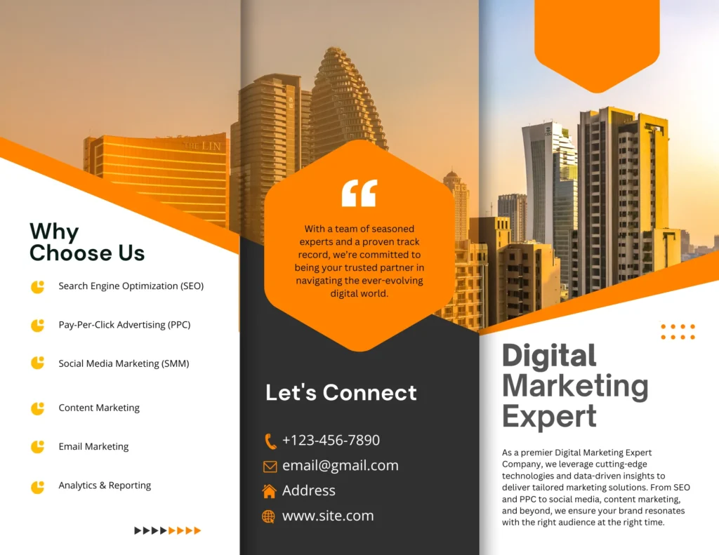
brochure design template

Service Brochure Designs

Clearly explain your services and show how your solutions solve customer challenges.

Product Brochure Design sample pdf
box icon

Product Brochure Designs

Showcase your products with key features, benefits, specifications, and applications.
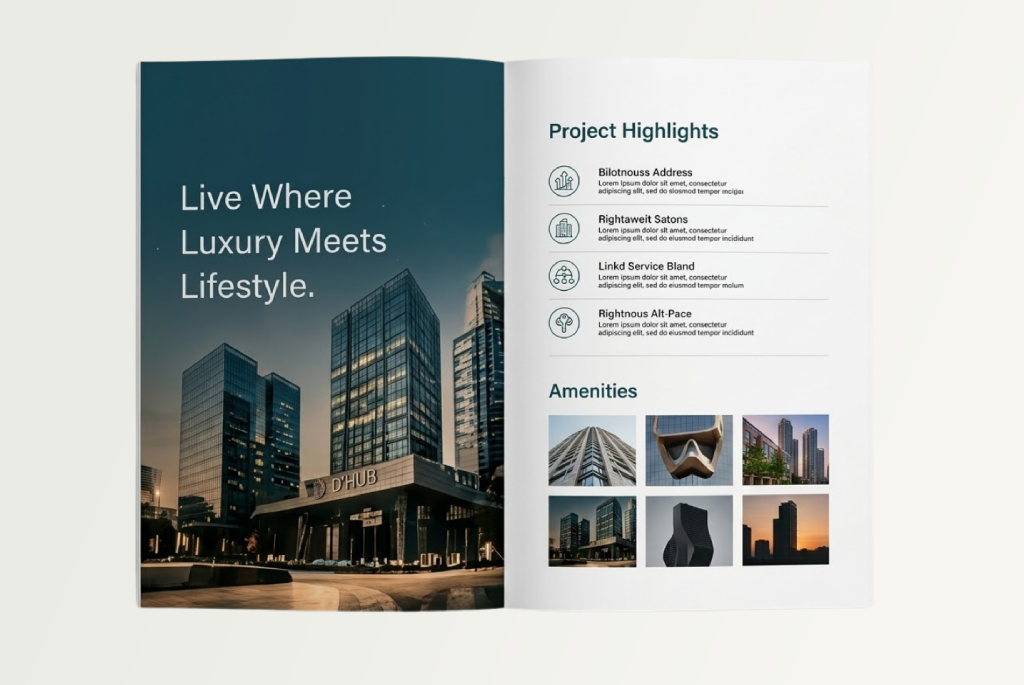
Real Estate Brochure Design examples pdf

Real Estate Brochure Designs

Highlight property features, floor plans, amenities, and location advantages with stunning visuals.


Healthcare Brochure Design templates download

Healthcare Brochure Designs

Communicate trust and care with information about services, facilities, and patient support.
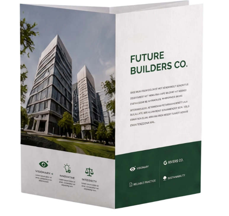
Attractive brochures are not necessarily effective brochures.

Focus on clarity, relevance, and purpose. Good design should support your message, not distract from it. Get brochure design services.

FORMATting a brochure

Popular Brochure Formats

Different businesses require different brochure styles.

Choose the right format based on your content, objective, and how it will be used.

bifold brochure template
01

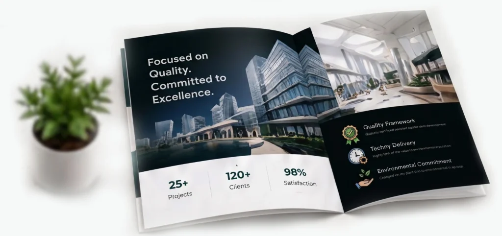
Bi-Fold Brochure

A bi-fold brochure consists of four panels created by folding a sheet in half. It provides generous space for images, product information, and company introductions while maintaining a clean, premium appearance.

FOLD STYLE

Folded in half
(4 panels)

COMMONLY USED FOR
3 fold brochure template
02

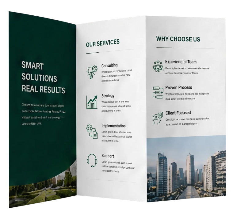
Tri-Fold Brochure

A tri-fold brochure divides the page into six panels. Its structured layout allows information to flow naturally from one section to the next. It is compact, easy to distribute, and cost-effective to print.

FOLD STYLE

Z-Fold Style
(6 panels)

BEST SUITED FOR
z fold brochure example
03

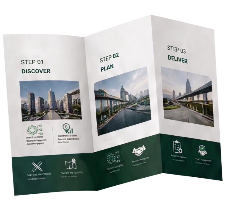
Z-Fold Brochure

A Z-fold brochure opens in a continuous sequence. It is useful for presenting step-by-step information, processes, or product journeys in a logical progression.

FOLD STYLE

Z-Fold Style
(6 panels)

IDEAL FOR
Gate Fold Brochure design samples
04

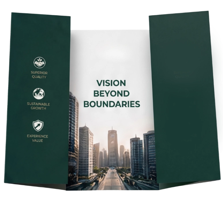
Gate Fold Brochure

Gate fold brochures open from the centre, creating a premium presentation. This style is perfect for showcasing large visuals and making a strong first impression.

FOLD STYLE

Gate Fold
(4 panels)

PERFECT FOR
importance of brochure in business

Why Brochure Design Still Matters?

Digital marketing has transformed how businesses communicate, but brochures continue to play an important role in business development. They provide something a website cannot always offer—a focused presentation that can be handed to a client, displayed at an exhibition, included in a proposal, or downloaded as a PDF.

Introduce Products & Services Clearly

Communicate what you offer in a simple and impactful way.

Support Sales Meetings

A powerful tool to support conversations and build trust.

Build Brand Recognition

Strengthen your brand identity and stay top of mind.

Promote New Products or Campaigns

Create awareness and drive interest in what's new.

Present Information in a Structured Format

Organize key information for easy understanding.

Leave a Lasting Impression

Well-designed brochures are kept, shared, and remembered.

Design a Brochure

What Makes a Brochure Effective?

Every electrical business has different strengths, target markets, and service offerings. Our process focuses on creating a profile that reflects your unique identity rather than relying on generic templates.

01

A Clear Purpose

Define the objective of your brochure before starting the design. Is it to introduce your company, promote a service, launch a product, or generate enquiries? A single objective keeps your content and design focused.

02

Strong Visual Hierarchy

Readers notice headlines, images, colours, and icons first. A clear visual hierarchy helps important information stand out and makes your brochure easy to scan and understand.

03

Concise Content

A brochure is not the place for long explanations. Keep your content short, relevant, and easy to read. Use meaningful headings and visuals to communicate more effectively.

04

Consistent Branding

Use consistent typography, colours, imagery, and messaging throughout the brochure. This strengthens your brand identity and creates a more professional impression.

05

Clear Call-to-Action

Guide your readers on the next step. A strong call-to-action encourages them to contact you, visit your website, or explore your services further. Make it clear and easy to take action.

Why Different Industries Need Different Layouts

Each industry has unique goals, audiences, and messages. The right layout helps communicate your value clearly and makes your brochure more effective.

free brochure templates download

Technology Companies

Benefit from modern layouts, bold visuals, and data-driven presentations.

Law Firms

Work best with clean, minimal designs that convey professionalism and trust.

Luxury Brands

Rely on premium photography, elegant typography, and generous white space.

Manufacturing Companies

Focus on capabilities, certifications, facilities, and technical strengths.

Good design is not just about how it looks, but how well it communicates.

The right brochure layout ensures your message connects, engages, and leaves a lasting impression.

Online Brochure Design - Mistakes to avoid
DESIGN PRINCIPLES & COMMON BROCHURE MISTAKES

Great brochure design is a balance of creativity, clarity, and strategy. Follow proven principles and avoid common mistakes to create brochures that truly work.

Brochure Design Principles

Timeless principles that create professional and impactful brochures.

Consistent Typography

Use clean, readable fonts that reflect your brand personality and maintain consistency across all pages.

Balanced White Space

Give your content room to breathe. White space improves readability and visual appeal.

High-Quality Photography

Use professional images that support your message and build trust with your audience.

Well-Organized Grids

A strong grid structure brings order to your content and creates a smooth reading flow.

Brand Color Consistency

Use your brand colors consistently to build recognition and create a cohesive look.

Readable Font Sizes

Ensure text is easy to read across all devices and in both print and digital formats.

Meaningful Icons & Illustrations

Use icons and graphics that simplify information and enhance understanding without clutter.

Proper Print Settings

Use correct margins, bleed, and resolution to ensure a professional print-ready output.

Brochure Design Mistakes

Avoid these common mistakes that can weaken your message and impact.

Too Much Information

Overloading pages with text overwhelms readers and dilutes your key message.

Inconsistent Fonts & Colors

Using too many fonts or mismatched colors creates a confusing and unprofessional look.

Poor-Quality Images

Low-resolution or irrelevant images reduce credibility and affect the overall impression.

Weak Headlines

Unclear or boring headlines fail to grab attention and communicate your value.

Overcrowded Layouts

Too many elements on a page make it hard to read and diminish the visual impact.

Lack of Clear Call-to-Action

Without a strong CTA, readers may not know what step to take next.

Inconsistent Branding

Different styles, tones, or logos across pages weaken brand identity and trust.

Outdated Information

Old data, prices, or contacts can confuse readers and reduce your credibility.

Removing unnecessary content often improves a brochure more than adding additional pages.

Focus on what matters.
Communicate with clarity.
Design with purpose.

brochure sample design

Frequently Asked Questions

Find answers to the most common questions about brochure design and formats.

How many pages should a business brochure have?

The ideal length depends on its purpose. Simple promotional brochures may contain four to six panels, while corporate brochures can extend to twelve or more pages.

Tri-fold brochures remain one of the most widely used formats because they balance space, readability, and printing costs.
No. Focus on the services most relevant to your target audience and provide additional information through your website or company profile.
Yes. A brochure usually contains multiple panels or pages and presents more detailed information. A flyer is generally a single sheet used for short promotional messages.
Ideally, both. A professionally designed brochure should work equally well as a printed document and as a downloadable PDF.
READY TO MAKE AN IMPACT?
Need a Brochure That Represents Your Business Professionally?

At 3C Brand Hub, we create brochures that do more than look attractive. Our team combines strategic content writing with professional graphic design to deliver brochures that strengthen brand communication, support sales, and leave a lasting impression.

Corporate Brochures
Company Brochures
Product Catalogues
Service Brochures
Marketing Collateral
Strategic Content

Well-researched content that communicates your message clearly.

Creative Design

Visually appealing designs that reflect your brand identity.

Print Ready

High-quality print files optimized for flawless printing.

Digital Ready

Web-optimized PDFs for easy sharing and maximum reach.

3c brand hub logo

We help businesses communicate better through powerful brochures and catalogs.