
FMCG
UK
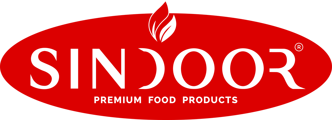
A simple mark with a strong story.
The logo reflects the purity, quality, and richness of traditional Indian food products, creating a clean and memorable visual identity.
Sindoor is based in Kerala and sells traditional Indian food products in the UK. Its visual identity and packaging create a consistent brand presence as the product range reaches customers in an international market. This project reflects our approach as a branding agency in Kochi, helping businesses build distinctive identities for their products.
Brand colours & typography
Bold. Natural.
Trustworthy.
A timeless colour palette and clean typography reinforce the brand’s purity and quality, creating a distinctive and consistent identity across the product range.
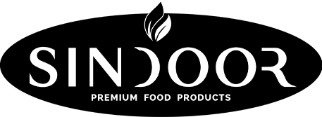
G: 0
B: 0
HEX: DC0000
G: 255
B: 255
HEX: FFFFFF
A strong brand is built through consistency. Beyond packaging, the Sindoor identity is thoughtfully extended across every touchpoint, ensuring the brand remains instantly recognizable wherever it appears. From labels and promotional materials to retail branding and product applications, every element follows the same visual language to strengthen trust, improve recall, and deliver a seamless brand experience.
Built on a consistent packaging architecture, Sindoor’s product range combines recognizable branding with category-specific differentiation. The result is a unified visual identity that enhances shelf impact, strengthens consumer trust, and delivers a premium experience across every product.
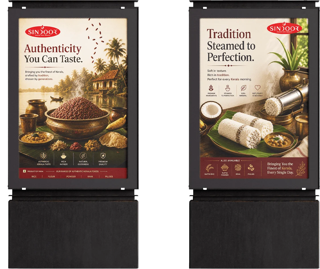
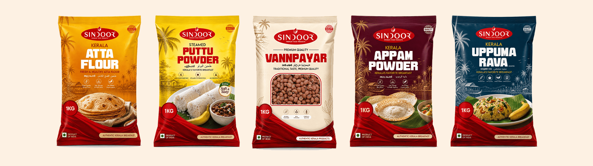
From concept to shelf.
A cohesive visual identity designed to bring SINDOOR to life across packaging, advertising, and retail spaces creating a distinctive and recognisable brand experience at every touchpoint.